 |
| Research. |
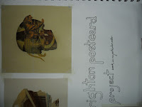
In this project we looked at different effects achieved on photoshop by editing photographs, we mostly looked at very commercial effects which are popular nowadays, after looking at each style we made a postcard for the Brighton Fringe festival in that style, using images, taken ourselves, of landmarks in Brighton.
 |
| Research. |
 |
| Research. |
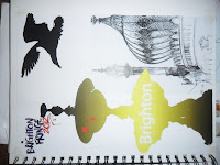
aThe first style we looked at is quite typography based, but it has a bit of freedom with the actual image you use, we looked at types
of this artwork, and it usually consists of a powerful image with a sepia colour fill or background, it generally will have some type of graph or chart or shape somewhere on the image, but the aspect we're taking from this style is the typography.
The first thing I did when making this postcard was choose an image, I decided to use one of a bandstand along Brighton seafront at night as this is a very easily recognisable image of Brighton due to the style of architecture.
Then I moved on to the typography aspect of the image, I choose a bold, tall font to use as for the effect i was going to do i needed the font to take up as much space as possible.
With the Image of the bandstand on the first layer, I made a second layer and paint bucketed it black, then typed out 'BRIGHTON FRINGE' with this text I magic wand tooled it and used the selection to delete over the layer of black which created a window for the original image to creep through the black space, for the final touch I added the Brighton Fringe logo.
 |
| Research. (Lisa Humphreys) |
This simple, yet effective technique on photo shop is good way of combining text and imagery, and I think I'll use it again when the opportunity rises.
 |
| Rsearch. (Lisa Humphreys) |
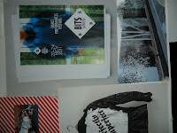
The second effect we looked at is sketch/drawing, for this we looked at the work of Brighton artist Lisa Humphreys, she draws views of Brighton, such as the pier and sea, her drawings are very lively and her style of drawing may be seen as slightly messy but it works very well.
We went into photoshop again to create similar images.
I tried out some experiments with the sketch effect on a few close up images of Brighton, such as a pillar, and I was quite happy with this one, I think it was to do with the definition of the stone pillar.
I attached the Brighton Fringe logo to this, and made it a kind of extra sketch-postcard.
 |
| Research. (Lisa Humphreys) |
I decided to choose an image with lots of detail for my main sketch postcard, I had taken one of the fountain in Brighton, I could tell that the fountain would translate good into the sketch effect as it looked similar to the pillar and had quite a dark tone, the problem being in the background was terrace housing, some of which are lightly painted, so I darkened these slightly before applying the sketch effect.
I like this effect when it's hand done, rather than over photoshop i.e Lisa Humphreys' work, and if i had more time I think I'd like to and draw some of my photographs and then scan them into photoshop for enhancement and so that i can add colour.
 |
| Research. (Lisa Humphreys) |
 |
| My first sketch style postcard. |
 |
| My second sketch style postcard. |
 |
| Vector art research. |
 |
| Vector art research. |
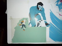
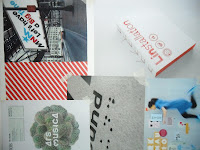
For the third style of postcard we did a style of graphics called vector art, this is done by taking a normal photograph and lassoing around the different parts of the image and creating a layer for each part of the image then paint bucketing it in it's own layer, we looked at an artist who takes images of people, typically athletes and turns them into vector images, he generally uses quite alien colours that you wouldn't associate with people.
 |
| Vector art research. |
For my vector postcard I wanted to choose something with good shape and the right amount of detail (not too much and not too little).
I chose a fountain at the bottom of Brighton just by the dome, I started at the top of the fountain, drawing round a seagull, as the fountain was made up of a lot of layers I found it quite easy to separate them, for colour I decided to use mainly purples but add yellow on certain highlights of the fountain.
 |
| Vector art research. |
When I was drawing around this image I considered drawing around the background but I thought that it wouldn't look very good and I just preferred the shape of the fountain alone (I could add a fake background later on in the process).
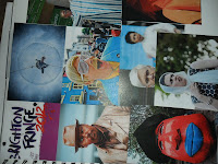 |
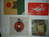
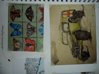
| Brighton Fringe mood board. |
As our postcards were for Brighton Fringe I looked at images of people taking part in the Fringe for inspiration, I saw that there were alot of unusual and quirky looking people, there were people who had dressed up into strange characters and alot of people who are performers, like singers and more performance art type acts, I made a mood board for these images.
 |
| Brighton Fringe mood board continued. |
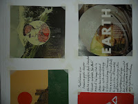
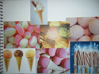
Then I looked at things associated with Brighton like Traditional sweets and ice cream, these kind of things you may associate with any seaside town but for me they particularly remind me of Brighton, once again I made a mood board.
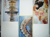
Then I created a mode board of postcard designs, I looked at traditional designs from various cultures, this helped me decide on the layout of my different cards, and also the balance of text and images.
 |
| Postcard mood board. |
My final moodboard was made up of images of different Brighton landmarks (some of which were my own original pictures) this was to set the scene of my postcards, some of the images would be used in my postcards.
 |
| Sweets/Ice cream mood board. |
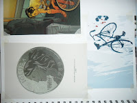
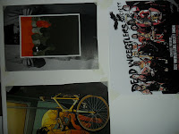
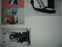
For final research in this project we looked at graphic designers Pam and Jenny who are a duo of graphic designs that make both sculptures and work that uses alot of different shapes and typography, I also see their work as collage type, I made one more final postcard based on inspiration from Pam and Jenny's graphic design work, this was also a mash up of all the different styles we looked at.
 |
| My collage postcard. |
 |
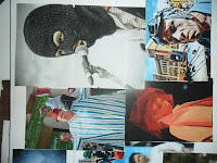
| Rsearch. (Pam and Jenny) |
I took a selection of Brighton-themed images, and tried out different effects on them such as a sketch effect, again as well as a gradient effect, and an effect were I took took all the colour and lightness out of an image, making it a silhouette, I arranged these in what I thought was a nice composition.
|
|
| My collage postcard progress. |
Overall in this project I've learnt different ways of editing photos and images to suit certain themes, I particularly enjoyed making vector art, I'd like to make my own vector art when I get the chance, and experiment with it a bit, sampling colours from the actual images, I think I prefer this technique to the others which we did because it's not actually a filter, it's more of a custom effect, which takes time and effort to achieve, where as the sketch effect and gradient effects taking about a minute to complete.
I've gained confidence with photoshop during this project, learning new methods of photo manipulation and basic photoshop skills that can be expanded to do a vast amount of things.
 |
<><>
<>
Research. (Pam and Jenny) | <><>
<>
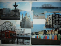 |
Brighton landmarks mood board.
(containing some of my own images.)
|
|
| Research. (Pam and Jenny) |
 |
| Research. (Pam and Jenny) |
 |
| Postcard mood board continued. |


