Project One - Fundementals
In this project we covered the basics Art & Design.
These are photos of my graphics sketchbook.


 Personally i'm not a huge fan of his work as i find he is just trying to re-invent other artists work, to promote his own name, that doesn't seem to be creative or original at all.
After looking at Mr Brainwashes work we had a go at his style and for that i choose to do something quite simple like he does, just playing around with colour.

 The first thing I did was choose a picture of the band (The Process) which we had be given to make graphic designs for, i choose a picture which had something going on in it, rather than something dull, once I was happy with this image i choose a background for my image (Something Mr Brainwash is known for doing) to add texture. I edited this background to make it quite water like, i did the same with the foreground image of the band.


In this project we covered the basics Art & Design.
These are photos of my graphics sketchbook.
This is the first artist we looked at in class, Josef Muller-Brockmann, he was a very import swiss graphic designer who created simple, yet very effect design, the fundamental parts of his work were shapes and typography, these are such basic aspect of s graphics design piece, but also can make a piece what it is. in some ways he set the foundations for what fellow graphic designers would follow for years to come.
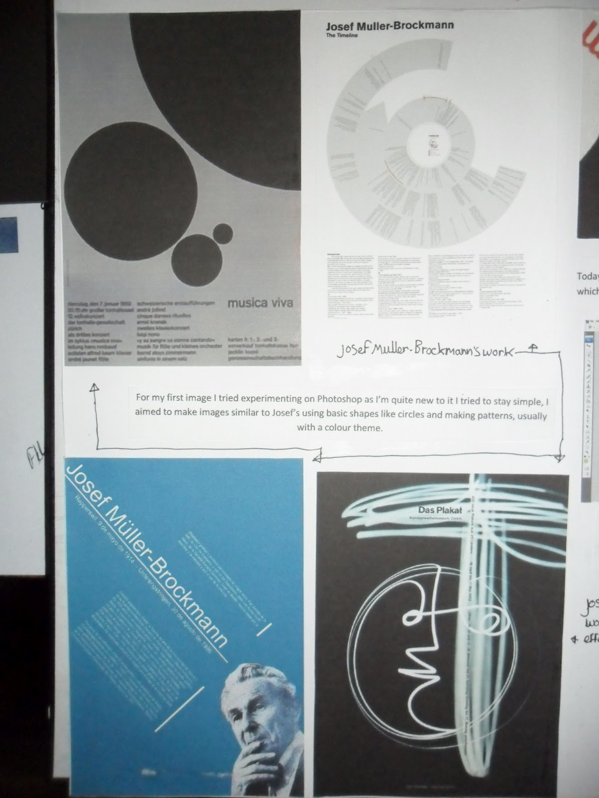
I quite like Josef's designs i find them very timeless, still looking modern and attractive to this day, i think it might be to be with the colours he uses and the lay out of image and text, it just shows what kind of impact he must have had on graphic design if he work still looks familiar in present time.


Commercially he was very successful. He began designing posters for the Tonhalle concert hall in Zurich in the early 50’s, and went one to become a founding editor of New Graphic Design along with R.P Lohnse, C. vivarelli and H. Neuburg.
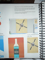
After researching Josef, we had ago at making a design slightly bsed around his style, for my i used an image that I took myself and experimented with repetition and shape, as these are two elements i found in his work that seem to re-occur quite a bit. Baring in mind I was new to photoshop when i made this I think i could make a much better version now, as my knowledge of photoshop has improved by far.

The next artist we looked at is Mr Brainwash, he is a graffiti artist who is linked with Banksy, Mr Brainwash takes other artists work and historic and cultural images and 'remixes' them to make his own version, a good example is his version of Andy Warhols print of Marilyn Monroe crossed between a picture of Michael Jackson, two very famous icons and faces combined.
 Personally i'm not a huge fan of his work as i find he is just trying to re-invent other artists work, to promote his own name, that doesn't seem to be creative or original at all.
After looking at Mr Brainwashes work we had a go at his style and for that i choose to do something quite simple like he does, just playing around with colour.

 The first thing I did was choose a picture of the band (The Process) which we had be given to make graphic designs for, i choose a picture which had something going on in it, rather than something dull, once I was happy with this image i choose a background for my image (Something Mr Brainwash is known for doing) to add texture. I edited this background to make it quite water like, i did the same with the foreground image of the band.
Overall i was happy with this design as this as still early days for my photoshop ability.
The final artist that i looked at for this project was Matt Needle, he is a young graphic designer who is quite commercially sucessful, as he has made lots of televison and movie posters.
His designs take alot of inspiration from Josef Muller-Brockmann, making shape and colour a main aspect of his work.
I can also see that his work is very vector orientated.
my favourite thing about his work is the colours he uses, they all seem to suit the theme of the posters very well.

After looking at Matt Needles work we did our own inspired pieces but made them as CD covers for our chosen band i made mine for the band, The Process, for this design i got a background from the stock images, i choose a paper textured background.
Next i got an image of the band, and drew around them a circular shape to fit them into an image of a magnify glass, as i though this would make a interesting, yet mysterious image.


I made a few more designs based loosely on music lables and band logos, i choose ones that i like but also one that are very well known and iconic, i took inspiration from these to make a few images that i put into CD cover templates and made into posters.
Most of these designs were made using very simple effects, for the image of the girl from The Process I enlarged it to A4 and softened it and increased the green hue. For a title i choose a basic font and centered it to the page, when it placed it in the middle the word 'The' came up over the girls dark hair, so i decided to make this word white so that it stands out alot and therefore is the focal point of the image, this is import as it's the only text in the image.
I went on to put this image in a CD template i had crop and resize it to fit the template, i prefered the original crop.

My other poster/piece is an image of the band i found in the stock images, i thought it had alot of energy going on within it. Pictured below, it depicts one of the band members jumping, and what kind of looks like headbanging, i animated the bands logo around the excitment of the picture, so it looks like some kind of erruption, i've also edited the exposed skin of the band members so it gives a stainglass window effect.


