Friday 25 May 2012

Project Five - Magazine covers

For this project we've been looking extensively at layout for newspapers, magazines  and other forms of typography and imagery combined.


My first design, Art Chantry inspired.
The theme for my magazine cover and my Conflict in Words and Images project as a whole is the London 7/7 bombings as I myself have a personal connection to this event, living in London at the time of the attack, and it also fits in nicely with the brief of the project.

For the imagery used in this magazine spread I've chosen images of obvious relevance to the attacks.
I took just a regular London bus and added an effect inspired by graphic designer Art Chantry who's work we looked at for this project - this effect is the decay of the images, I replicated this on the bus by cutting it up and separating the pieces then grouping the layers back together, allowing me to move the image as one. Also in alot of his posters he uses a halftone filter effect which I used on the background image for my magazine, as well as turning it black and white to bring out the foreground images, I split up the background explosion to the actual skyline as I found this very effect in bringing out the cloud, which only had a black and white effect, I also seperated the ground in the background, using magic wand tool, I turned the hue red and increased the saturation to bring some warmth into the image. I think using the rule of three to break up the background worked well and I may do this again in the next magazine spread I make, I also tried to keep to mainly using black white and red as alot of the posters/war images we've been looking at throughout this project stick with this colour scheme, it does work very well for something involving conflict, it seems to represent power and conflict.
In the making.
When I brought the bus into the image  I highly considered putting the text onto it as if it were some type of board, I did start to do this by blacking out the advert on the side and writing 'London BOMBings' over this, I originally intended to make this a bit like a title but I thought that this may damage the layout and magazine feel. I kept this small bit of typography because it didn't damage the overall look of the spread and going back to the brief of the project - 'WORDS in conflict and IMAGES' this was my way of directly combining two of the main elements of the project.
The layout of my magazine spread is based mainly around the positioning of the mushroom cloud, I see this as the main focal point, therefore I decided all the other typography and images had to revolve around this.
In terms of who my audience would be for this magazine, I think it would mainly be aimed at teenagers upwards, and I don't think you would have to have certain interests in order for it to appeal to you.


My final explosion style magazine cover.


This is a another quick magazine cover which I created in photoshop, it started off with an idea in my head about emphasizing the damage to the underground train, and making quite a graphic image out of it.
So I thought that adding fire to the image would be a good way of doing this, firstly to make this I choose a very active image of the train, once I had this I lassoed around the edge of the train and took all colour out of the surrounding area, as well as dimming it down slightly, this was to make the the train stand out even more than it was going to later on.
Secondly I found an image of fire, I wanted something explosive, quite literally and I found this and took it into photoshop, Prior to adding it to the train image I made no changes, although I originally intended to add a halftone filter, I decided however to keep it in it' naturally state.
Finally I drew around the train and took this selection to the image of fire and put it other what i thought to be the most effect and consistantly aggresive part of the fire, once I had it, I copied and made a new layer to past it into. I then laid this over the train and used an overlay filter to combine the two images, it created a really exciting image that i was overall very please with, it was more graphic than I thought it would be, I had a more comic stip look in mind, but I was happy with it.


In the making


Four different versions of my final piece, all the same design with the bus', but up again different coloured backgrounds.


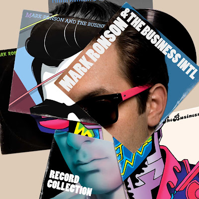
My final design was heavily inspired by Mark Ronsons album cover for Record collection. I took an image of a few London buses and copied shards of the images and pasted them over the original to these shards I gave half tone filters and bright pinks, blues and green overlays I even overlaid some of the shards with each other. i took away the original image of the buses which lay in the background, this cleaned up the image a bit. I made a selection of different coloured backgrounds, as I couldn't decide a final one. Without intending to be the cover looks very Pop Art in style. 
Mark Ronson's album cover for his album 'Record Collection' my third
 magazine spread took alot of insiration from this.


My magazine layout in the making.


Friday 18 May 2012

Project Five - Art Chantry

This is the work of Art Chantry, an American graphic desginer who is known for his work on poster and album covers for American grunge bands.


Thursday 17 May 2012

Tate Modern & Tate Britain visit.


Here are pictures that I took on a college trip to both the London Tates, I've narrowed down my favourites out of the many that I took.


Amos Coal Power Plant Raymond West Virginia
 70" by 92"
2004
Mitch Epstein.

I choose this image due to it being one of the only landscape-based images around tate modern that I could find, it could also be relevent to the nature/manmade project an artwork which is like a corss over, something that could join the two halves of the project.


Whaam!
67" By 160"
1963
Roy Lichtenstein.

I choose this Roy Litchenstein image because it's quite an iconic image, It has relevence to the Words & Images in conflict project, pop art as a movement is highly related to that project. As an image in a gallery it stands out against others because of its easily identified commercial style which Litchenstein achieved by taking an original comic strip panel and enhancing. 

Head of a Woman (Fernande)
Plaster
1909
Pablo Picasso.


Woman with a Coffee Pot
Oil on canvas
1919
Jean Metzinger.
Study for 'Sappers at Work:A Canadian Tunnelling Company, Hill 60, St Eloi'
1918-1919
Oil on canvas
David Bomberg.
Linen
Oil on canvas
1913
Natalya Goncharova.
Self Portrait
Synthetic polymer and silkscreen on canvas
1967
Andy Warhol.
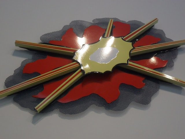
War Explosion II
Enamel on steel
1965
110kg
Roy Litchenstein.
I choose this photo of a Roy Litchenstein sculpture
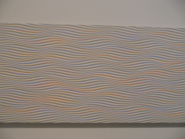
To a Summer'sDay
Acrylic on canvas
1980
Bridget Riley.

Water-Lilies
Oil on canvas
Claud Monet.


The Uncertainty of the Poet
Oil on canvas
1913
Giorgio de Chirico.
Half-figure
Armenian marble
1932
Henry Moore.

Thursday 10 May 2012

Project Four - Art Movements research & David Hockey research


These are some of the art movements which I've been looking at throughout this project.


Caspar David Friedrich's Wanderer
 Above the Sea of Fog.
Romanticism

Anne-Louis Girodet-Trioson's Receiving
the Ghosts of the French Hero's.
The first Movement i looked at during this project is Romanticism, this was a movement that occurred from 1800-1840, as a revolt against the industrial revolution - a movement that really emphasised the beauty in nature, during the time allot of science was being discovered, not long after the movement Darwin published his theory on natural selection. Not only was it a painting movement, but a movement in literature and music, so overall an artistic one. Most Romanticism paintings are landscapes, so that they present the Beauty of the natural landscapes, they were also known for containing mythical creatures, with dramatic scenes, they all tend to be painted in a very realistic style.

The relevance of this movement in my project is mainly the influence it has had on other movements that came after it, but also the way it portrays nature and landscapes, I probably won't be taking much from this movement.


Gustave Courbet's Bonjour, Monsieur
 Courbet.
Realism


The second art movement i looked at is realism, It is similar to Romantics in the style that it is painted, but the subject matter is much different, Romanticism was created to show strong emotion and passion towards nature but Realism is against that Exaggerated emotionalism, Realism painters believed in truth and accuracy when painting, this shows in their paintings as some of them are painted like photos, photography was introduced around the time of Realism, photography could also be seen as a form of realism as an art.
Jean-Baptiste Simeon Chardin's
Woman Cleaning Turnips.

Once again, i don't think I'll be taking much directly from Realism in my work, as it's one of the older movements that inspired proceeding movements.


Impressionism
Claude Monet's Impression, soleil Levant.

Impressionism was an art movement that rose in the 1870's, the name of this movement originates from a Claude Monet painting, 'Impression, Soleil Levant', pictured to the right, Impressionism differs from classic painting of the time in the way it's painted, by the colours applied, and how they're mixed. Characteristics involved in typical Impressionist paintings include: Usually brush strokes are small but visible to the eye, Bold colours are placed side by side creating vibrancy in the paintings, Allot of attention is paid to natural light in the paintings, as well as shadows, to add a previously unseen freshness in paintings.
Claude Monet's Haystacks, (sunset).

I see this is a major turning point in landscape painting, as well as art in general, so i think this movement is highly likely to influence my work, both in graphics and art and design.


Surrealism

Salvador Dali's The Persistence of
 Memory.
Max Ernst's L'Ange du Foyer
ou le Triomphe du Surréalism.
Surrealism is an art movement that originated during the 1920's, the paintings are known to contain what some people might see as randomness - this is usually the juxtaposition of objects within the painting, this is to create surprise for the viewer. the style they were painted in is very much like impressionism, but most surreal paintings contain a broad spectrum of colour, take Max Ernst's painting pictured to the right for instance - it contains a skyline and landscape in the background, which appear to be painted normally, and would in fact make a typical Impressionist painting but the creature in the foreground is a major juxtaposition in the image, the name of the piece translates to 'an angel of the fireplace or the triumph of surrealism' so maybe the creature is a representation of what surrealism is to Ernst, either way this 'angel' isn't painted like the angels you would see in a Romanticism painting, firstly because it has a heavy use of strong obvious primary colours, it's also a very aggressive image with lots of movement, i can see this theme of horror re-occurring in many different surrealist paintings, maybe it's that shock factor that makes up a large amount of surrealism.
I really like the image of surrealism personally, I find it has a lot of depth to it and a humorous aspect. It has made it's way into modern graphic design, because with programs such as photoshop the potential to make unusual and surreal art has increased dramatically, even from a photo or image that has no surreal element before hand, you can turn into something with much more life.
I would to try and give my work a surreal touch


Pop art

Roy Lichtenstein's Whaam!
Pop art is an art movement which began in the mid-late 1950's, it has a very recognisable style, this is from the imagery that is used within it, a lot of the time pop art contains commercial advertisements but out of the context which they would have originally been intended. A slightly different example of pop art is Whaam! by Roy Lichtenstein, picture to the right, this has been based on a comic frame from 'All American Men of War' by DC comics, this is a very emotionally effective piece, but it leaves the viewer to decide on what that might be themselves, it's comes across as quite a simplistic idea and having said that it is, but to the viewer it comes across as a powerful and exciting art piece, it may even attract comic book fans..
Pop art is quite a step away from traditional fine art, in the way that it's very commercial (in some cases it uses actual advertisements) and seen by come critics as manufactured, I see Andy Warhol, one of the founding and most public Pop artists 's work as being very similar to alot of modern graphic design work, I would image that he's inspired many generations of graphic based artists and will continue to for years to come.
Richard Hamilton's
Just what is it that makes today's
homes so different, so appealing?
 My round personal round up of a piece Pop Art is - usually bold prints of recognisable isolated, sometimes commercial images presented for the viewer to give his or her own interpretation, the boldness of works is achieved in a way that is also done in graphic work.

Andy Warhol's
Campbell's soup 1.


David Hockney


David Hockney was born in Bradford in 1937.
He was educated at the royal college of art, while studying there as a student, his work was featured in an exhibition called 'Young Contempories', Artist Peter Blake also had his work featured, this exhibtion sparked the beggining of British Pop art.

He was strongly Accossiated with Pop art, but alot of his earlier work has similarities to Expressionism.

Winter Timber.
In the mid sixties he traveled to america, where he met Andy Warhol in New York, then he headed to california where he lived for many years. When in Los Angeles he was inspired to paint a series of swimming pools, he painted these in the then relatively new medium of acrylic paint - he painted these in a very realistic style and used vibrant colours.

Although Hockney is known well for his earlier Pop art work i'll be focusing on his more recent landscapes instead as they have a strong relevance to this project.

Winter Turned.
In class we watched a documentary on Hockney and how he's been chosen by The Royal Academy of Arts to exhibit his landscapes. The exhibition, named "David Hockney RA: A Bigger Picture" showcases Hockney's landscape works that span a 50 year period, it will also contain some of his recent ipad landscapes, we watced as he went out to the ountry to make these paintings and ipad drawings, he usually does them in one go and whats even more astonishing is the scale of these paintings, one of the largest of them being made up of 50 canvases and measuring 12.2m by 4.6m.
The Road to Thwing.
These paintings and prints fill entire rooms of the gallery, being surrounded by these towering paintings must have overwhelming effect, like you're alomost in the landscape.

What i really like about these landscapes is the way you can break up the group of canvases to make singular works of art that work well either seperated or grouped. This is something i would be interested in doing for an outcome.
This type of painting (one image on everal canvases) also gives you some freedom on layout for instance, if you wanted you could lay each canvas just a few inches apart, have them with no gaps or have them with enormous gaps.


Tuesday 8 May 2012

Project Four - Final Piece Exhibiton and Evaluation.

My final painting's all placed together.
For my final piece for the 'Epic Landscape's' Project I decided to Paint in the style of Fauvism and David Hockneys recent landscape work.                                            The main characteristics that I wanted to take from Fauvism were the vibrancy and warmth of the colours, the reason for this is because I felt it depicted a different  view of the image, something you wouldn't capture in bog-standard landscape photograph or landscape painting.                                    
Painting no. 1
Painting no. 2
The first thing I needed to do for my painting was to actually choose an image, for this I chose an area of land that I was quite familiar with, somewhere I thought was full of life but not at first glance, I went to Devils Dyke just on the outskirts of Brighton - it is an area of outstanding beauty and is apart of the south downs, so it stands high, towering above the many fields to the north. I took a walk around the edge of the Dyke, taking photos as I went. On the day that I went the weather was quite dull, it was a grey/white sky with no sun breaking through, but I liked this as it gave me the opportunity to use the unusual colours that painters used in Fauvism. I looked through the photos that I took and decided upon the one I used based on the fact that in my vision I split it into quarters and I thought each section would work well as a separate piece as well as the original image as a group, this takes me to the next influence on my piece, David Hockney, who was initially known as a pop artist, he had success with pieces such as 'A bigger splash' but in more recent years he has been making landscape paintings, these have varied in size some being absolutely massive while others being not so large. Hockney's landscapes were subject to an exhibition for the royal academy which consisted entirely of Hockney's landscapes and nothing else, we saw a documentary on this and how he created some of these, for instance he uses an Ipad to draw some of the landscapes and then enlarges them on a print. The way he paints his landscapes that interests me though is the way he presents them on a series of canvas' allowing the separation of a landscape artwork and making smaller, somewhat more abstract pieces.

Painting no. 3
The first thing I needed to decide when painting these was how I was going to paint them, I had decide upon my image and had printed it in colour on the top half of a sheet of a4. At first i considered painting from this rather small image but then i thought if I'm to paint this cut up image on 4 different canvas' from hand then it won't be very accurate and they might not even much up, so I printed this image on the a4 paper onto a sheet of acetate, so i could project the image and accurately copy the main shapes in the picture, I did this to keep a realistic element in the image.
Painting no. 4
I set up an aisle and a projector, placed the canvas on the aisle, before painting any detail onto the first canvas I mixed up a vibrant greeny-yellow mix (going back to Fauvism) and spread this across the first and second canvas, as they are the top ones, this was going to be the skyline colour. Once the background for painting no. 2 had dried I began to paint the details of the trees which were being projected onto the canvas, for these thick tree branches I mixed a reddy-brown to keep a warmth in the colour. After painting in most of the detail in painting no. 2 i did a quick red wash over areas of shrubbery and then added watered down shades of blues of and yellows to add a bit more depth and interest.

On painting no.1 the majority of the painting was completed with the background, but there was a bit of detail at the bottom, achieved using the same processes I had gone through with painting no. 2, I felt this was a very important canvas of the group, as it broke up the other three slightly with the sheer amount of blank space, instead of blocking up the view with details, I like to think of this as the mellow canvas.
Paintings no. 3 and 4 were made using a different approach, although I started them similarly, doing a dull yellow, then intense paint wash for the background. But when I projected each image on each canvas they weren't very clear at all, in fact I could only make out the dark footpaths so I painted the parts of the image that i could see clearly, i finished the rest of both paintings using just the original print out of the picture i took to paint from, allowing me to be alot more free with my painting style, as well as using unusual colours.

Overall I'm happy with my final outcome for this project, if I were to improve on it, I would spent more time planning on how I would go about painting it. I would also look further into depth on my influences, so that I would have alot of knowledge to go by when using certain techniques and processes. I'm happy with how my actual paintings turned out, despite the latter two not going to original plan, I think as a composition they work well, each canvas Ad's it's own mood and energy to the picture.
 In my opinion I've achieved what I set out to, I took a lifeless photo and filled it with colour and atmosphere, I say the photo is lifeless, but what I mean is that has hints of life here and there, but I've exaggerated these patches so it fulls the entire image.
                                                                                                  

,

The Photo i choose for my final piece, Devils Dyke.